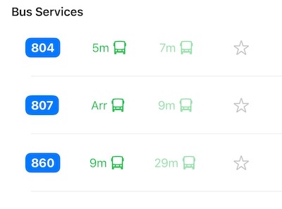
This was the default bus symbol used in the earlier version of the app. I wanted a more versatile bus icon that could represent different types of buses. In Singapore, we have single-deck, double-deck, and bendy buses—and I wanted the app to visually reflect that variety.
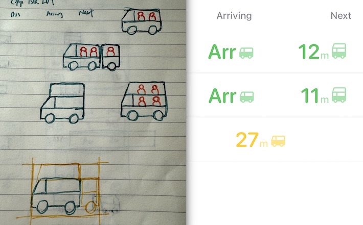
Clearly, I’m not a designer—but the challenge was real. I needed an icon that could represent all three types of buses while keeping the same width and height for visual alignment with surrounding elements. At one point, I even considered showing bus load by cramming tiny person icons inside the bus. (Thankfully, I quickly realized that was a terrible idea.)
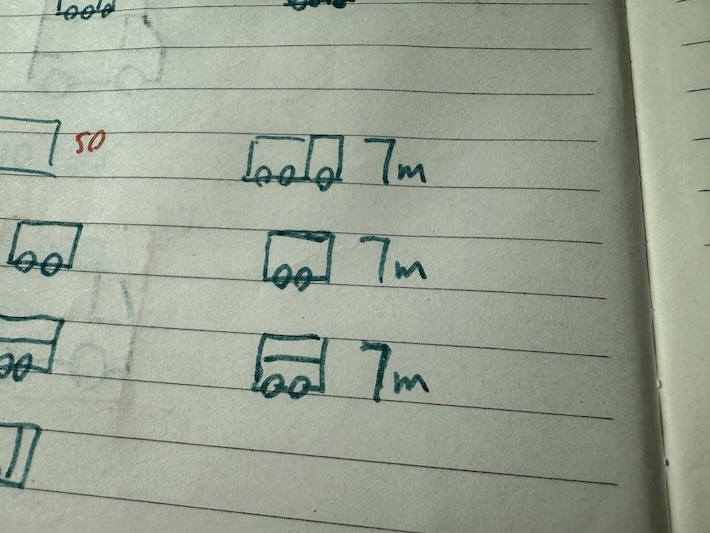
Back in my chatbot days, I learned that emojis should always come first, followed by supporting text. Since most people read from left to right, placing the emoji at the beginning helps them quickly grasp the context—seeing the icon first, then the text that reinforces its meaning.
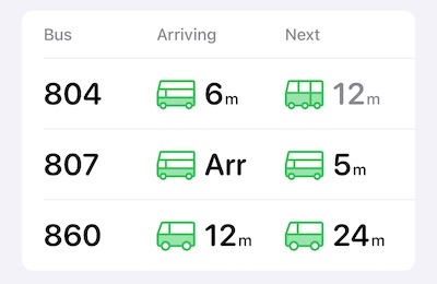
Placing the icon in front made the layout look much more aesthetically pleasing. I also redesigned the bus icons to ensure all bus types have the same width and height for better visual consistency.
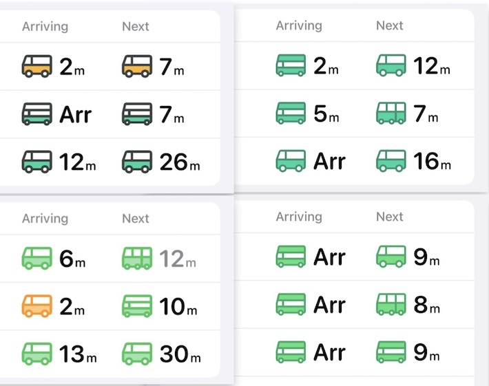
I experimented with different styles, but my son told me he still prefers the first version—so the first version it is.